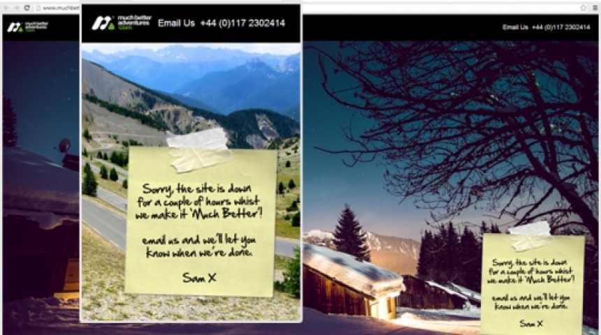
I wandered over to MuchBetterAdventures.com last week and found their site was under going maintenance.
But I didn’t just guess that because it was down, or see a boring white page telling me so – they bothered to design an attractive, responsive page with changing background images so that they carried on giving off a professional look and feel.
Meanwhile the post-it note keeps the tone friendly and personal (I used a post-it note for their demo site when I designed the first incarnation of MBA back in 2010, so I was pleased to see it still there!).
For some large project the agency I work for design and build maintenance pages as part of the project so that should they ever be needed, they’re ready to go. They’re very much a “nice to have†and so not generally included on a standard build where budget is tight, but when you see a good one in action I think it proves worth just that couple of hours extra thought and work.


