Over the weekend I bought some wellies for my little boy from mothercare.com (because they were actually more cost effective than Amazon).
I’ve used their website many times before so I know it’s a good site which works well. However there were a couple of things which got a little frustrating and so could be tweaked to make the user experience even better.
Out of stock:
Now, it’s not surprising that all the really cool (cool as in, Thomas the Tank Engine etc. – cool if you’re a baby!), cheap wellies were out of stock. That’s just how life goes. But there were quite a few times I clicked on a listing from the search results, just to wait for a product page to load (on my phone) and be told that the item was out of stock. So then it’s a case of clicking back to the search results and starting over.
It’s not a big deal to click back and look again… but after this happens 2 or 3 times, you do begin to wish they’d just told you on the search results page that there was no stock. I feel mothercare have got room to put a neat little red “X out of stock” message on their results somewhere.

I know some people suggest not showing items that are out of stock, but personally I prefer that they are shown, just clearly labelled. That way if you’re looking for something you found the week before but which has since sold out, you don’t wonder where it’s gone or keep searching for it. Similarly, if something’s out of stock but available to order for when it comes back in, I’d want to know that in the search results (ideally) because I need these wellies asap! So pre-ordering – or mothercare’s feature of “email me when back in stock” wasn’t an option for me on this occasion.
Load more:
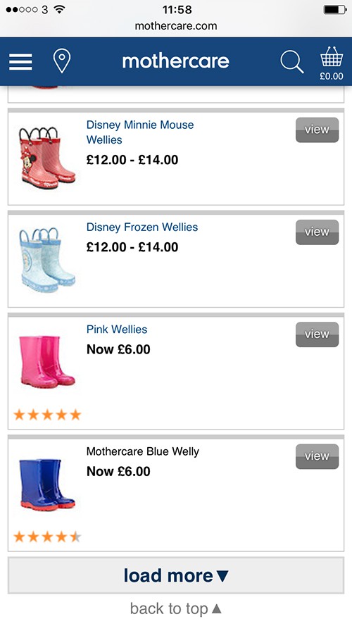
The mothercare search results are loaded a few at a time, with a “load more” option when you reach the bottom of the current results. This helps keep the search page loading in a timely manner and the “load more” feature is quick and easy to use.
However… if you load more, and then load more again, scrolling down and down the list of results… and then click to look at a product, decide it’s not right (or out of stock!), and hit “back” – you’re taken back to the initial results and have to make you way back down to where you previously were, hitting “load more” a few times in the process.
Again, this isn’t a big deal until it happens a few times. And you find it’s taking you a while to get back to where you were just a minute before. It would be great if hitting “back” – which becomes second nature on an iPhone – or pressing the “back to search results” button mothercare show you on the product page if you’ve gone directly from search results, took you back to where you had previously gotten to. Sometimes it can be confusing to be jumped to a part of a page, so you could perhaps be taken to the top and then automatically scrolled down so you can get your bearings. Or they could just jump you back to where you were, because in the micro-climate of frenzied phone shopping whilst your baby is taking a nap, lots of phone users would – I suspect – be comfortable with this.
Scrolling isn’t time consuming though – I’d have been quite happy scrolling back down to where I’d gotten to; it was having to click “load more” repeatedly along the way which seemed like a hurdle. So dropping a cookie with details of how many sets of results I’d been viewing might be handy here.
Filter by size:
Now, this one only came up towards the end of my welly search when I was starting to give up . Coming from a technical background, I’d avoided searching by size because I didn’t think it would work as I was searching for shoes. But after several unsuccessful product views of wellies that were too big for baby feet, I looked for a size filter – and I found one…
But I was right – it didn’t work.
The reason I didn’t expect it to is because I didn’t expect mothercare to have a different size filter mechanism for shoes than they do for clothes and toys. And they don’t. But it would be really handy if they did.
I was looking for size 4 wellies. When I clicked to filter by size, I was given size options in months – 12 – 18 months, 18 – 24 months etc. Hoping that there had been some size mapping done with rules in place that 18 – 24 months might equal, I don’t know, sizes 3 -5, I gave it a whirl.
I was returned a set of results with 4 pairs of welly socks. No wellies. Ho hum, I thought (forgetting my previous doubts about a size filter working), that’s why I couldn’t find any – they just don’t have any wellies in size 4. And so I very nearly left.
But because the prices were really good, I thought I’d just try a little bit longer, looking at individual welly product pages and checking the sizes and availability. I suddenly got lucky and found a couple of pairs in size 4. Now, I don’t think my little man has particularly small or large feet, so I’d hazard a guess that if sizes had been mapped, searching for wellies for 18 – 24 month olds, should have brought back size 4 options. The fact that it didn’t shows that the size filter isn’t accurate for shoes and could quite possibly drive customers away as it gives the impression that it does work and is accurate.
Zoom!
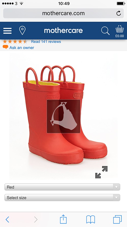
One feature that I do think shows a nice consideration of user experience is a little “zoom” image that appeared for a few seconds over the main product image, before disappearing. It shows you that you can zoom in (when on a phone).

In conclusion…
In the end, I bought a nice pair of blue wellies for what I regard as a good price and I’m looking forward to picking them up – having an account with mothercare meant it was quick and easy to select my local store for pick up, saving any delivery costs.
The mothercare site is visual and colourful and works well – but when you’re hunting for something in a hurry the aspects above could make the user experience just that little bit smoother.
