In a bid to make things useful for visitors, improve UX, and boost sales, are you guilty of over engineering your site search?
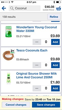
I was using the tesco app recently and I wanted to buy some sort of dried coconut – I was open to suggestions (I was using some hipster American cookery book so I didn’t expect to find exactly what they said I should use) so I just searched for “coconut”.
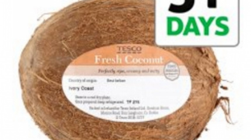
The app brought back a lot of results, and I scrolled through them and found something suitable. But on the way to finding my solution, I laughed to myself when after a LOT of scrolling, I came to an actual coconut:

I laughed because, had I been looking for a coconut – this was a long way down! It was number 60-something out of 158 results. Possibly because it was listed as “coconuts” but I kinda wonder if it’s because the search takes popularity into account and more people buy coconut shampoo than actual coconuts? I didn’t want an actual coconut, but it did make me think that if I was looking for one, it’d be quite a long scroll and I probably wouldn’t even have found it because I’d have expected it to be at the top – and when it wasn’t there I’d have assumed they didn’t have any. Perhaps just coconut – the most obvious result – could have been top with everything else sorted by popularity (if that’s how it’s done) after that?
Trying to be too helpful
This reminded me of an issue I encountered with Argos and ELC when Christmas shopping. I wanted to buy a Thomas the Tank Engine toy and I wanted to compare prices. I wasn’t sure on the full title of the toy, so I just searched for “Thomas” expecting to just quickly flick down through everything they had.
But instead of just seeing a list of search results, searching for “Thomas” actually takes you on each site to a nicely designed landing page (here on ELC and here on Argos), featuring key products or dividing things up into categories. Whilst browsing on my phone, this just didn’t seem helpful at all because the little stocking filler I wanted wasn’t there. (As with most of my Christmas shopping, I was doing it during a little man’s nap time, and every second was extremely precious.)
On closer inspection, there’s a link at the bottom of the Argos landing page to “view all” Thomas toys, and the ELC page does try to help you narrow down your search by category. But when using a search bar I really just expected a list of products to quickly glance down. Perhaps a banner could appear at the top of the list inviting me to explore the Thomas range, or find help choosing a Thomas product, which could then lead me to the landing page – but these pages in my case actually just caused a hurdle.
Research your audience
The websites I’ve cited in this article are BIG and I’m sure they know what suits the majority of their visitors so perhaps if landing pages and hidden coconuts suit the majority of their customers then they’re right to do that. But very often smaller websites like to take the lead from the big guys, and so if you’re planning a change to your search – or if you’ve made your search work in one of these ways – stop for a minute and check that you’re doing that based on user feedback and research rather than just because it seemed like a nifty idea.
If you’re over stretched and would like us to write a test plan for your website, carry out a UX review or test your site across various devices, please get in touch.
