Facebook have been rolling out their new look for users across the globe over the last few months and I’ve just seen it today.
It’s pretty striking and is apparently intended to make the website run faster with smoother transistions and an easier navigation structure. It should also be easier to find things.
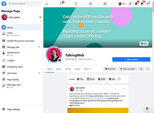
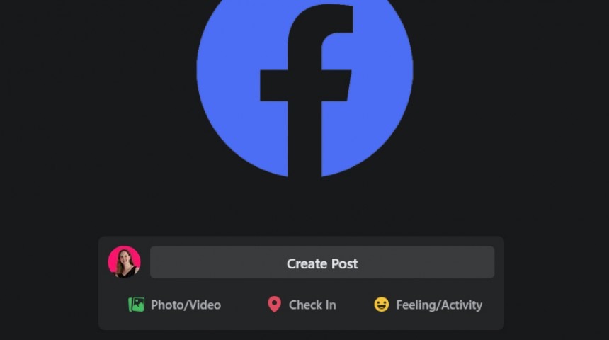
Probably the biggest change though is the new Dark Mode – designed to minimise screen glare if you’re using Facebook in a darker room. This is achieved with a radically different look to help with brightness, contrast and vibrancy.
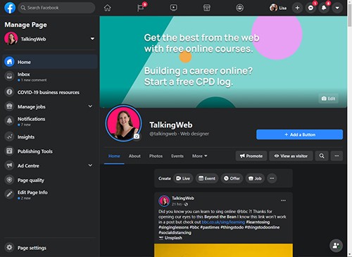
When you first get access to the new design there’s a splash screen that tells you you’re about too see something a little different and gives you the option of dark mode being on and off. I selected for it to be off, and saw the white screen but then tried to find how I could switch to dark mode just to try it out.
After going through various settings screens from the left hand menu, I found it by clicking on the arrow at the top right of my screen and seeing the very easy to use little Dark Mode toggle.
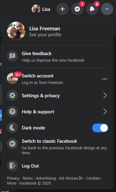
There’s also the option there to “Switch to classic Facebook” so you can go back to the old design at any time. I expect this will disappear eventually once they’re happy that they’ve got rid of any teething issues with the new design and have collected and acted on any pressing feedback about the new design. And wow, will there be feedback – can you imagine rolling out a major change to 1.6billion users, many of whom use this site regularly and many of whom won’t be seasoned web users?
This whole article may be old news for you if you’ve seen Facebook’s new design on desktop for the last few weeks – as such a large website with so many users they tend to roll changes out gradually so as not to be hit with too much feedback at one go. Meanwhile despite updating my mobile app to the newest version I don’t seem to have the Dark Mode feature on there yet, despite hearing that it’s on it’s way.
Personally I like the new look, although I find the gradient on their F logo a little dated (Web. 2.0 anyone?). I doubt I’ll bother to use Dark Mode, but it’s an impressive feature. And from a first glance I find the new design much cleaner and fresher than the old interface. What do you think? Let me know on Facebook!
