A key aspect of making websites accessible for users is ensuring your text colour is readable against the background it’s on. This is referred to as the contrast and is very important for visually-impaired users to be able to clearly distinguish the characters on the screen. It’s also important for non-visually impaired users because if the text isn’t legible then it may encourage users to leave your site and look elsewhere.
Luckily, most modern browsers have an in-built tool to test if your text is legible to Web Content Accessibility Guidelines AA or AAA standards. To achieve AA level compliance your text must achieve a contrast ratio of 4.5:1, with exceptions made for larger text which is 120-150% larger than the default body text.
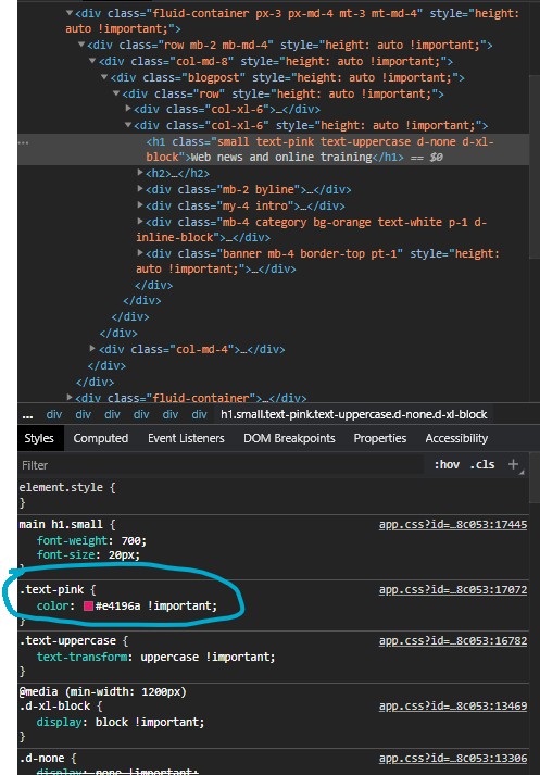
To find this option in Chrome just hover over the text you want to test and right-click, then select ‘Inspect’. You should see a panel open to the right of the page, make sure the text you want to test is selected in the Elements section of the window (you can see from the below screenshot that the selected text is “Web news and online trainingâ€) You should then see a section called Styles (usually located on the bottom half of the panel) with some rules listed that apply to that element, within this section find where the ‘color’ rule is set. Make sure it isn’t strickenthrough as this means the rule is being overwritten, keep scrolling until the rule appears normally.

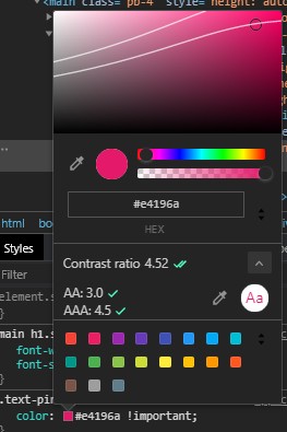
Open the colour picker by clicking the coloured square next to the hex code and you’ll see the Contrast Ratio listed. You can expand this section by clicking the arrow to the right of ‘Contrast ratio’ to see more detailed information such as which WCAG standard the text adheres to, it will also add a couple of lines to the colour chart at the top which will show you where on the chart you can set the colour while still maintaining enough contrast, with each line representing either WCAG standard. If the text is on a light background then you’ll want to be below the line and if the background is dark then you’ll want to be above it.

This functionality is available in Chrome, Firefox and Edge, no support in Internet Explorer or Safari at the time of writing (no surprises there) but it’s simple enough to just switch browsers to test contrast levels. If you want to test colour contrast for an entire page then Google recommends installing the Accessibility Insights plugin which can run an audit over the page where one of the checks it performs is for colour contrast.

