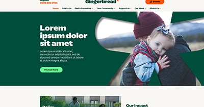
We are so proud to have worked on the brilliant “new” website for leading single parent family Gingerbread.
I say “new” because it’s actually the same WordPress website they’ve had for years, which we inherited from their previous developers. The amazing team at Gingerbread knew they needed to radically change their site, they knew lots needed fixing (both behind the scenes for them and for a better UX for their visitors) and they knew they had a new brand incoming. But after a chat we decided that actually, they didn’t need the expense and headache of a new website; we could make the old one work for them.
Before, left and after, right:
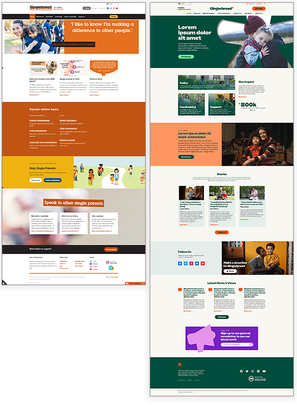
Over the past 12 months we’ve helped the “old” site limp along, fixing various things based on a priority list we’d drawn up with the Gingerbread team. We also migrated them to a new server – not a slight task, on a big cumbersome WordPress site which receives a lot of traffic – but it went smoothly and without a hitch!
Our approach to the overhaul project was to work out what we could be done ahead of getting the new brand guidelines and doing that as soon as possible, so we could meet the deadline of a June launch.
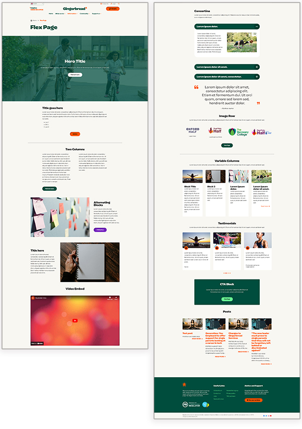
Therefore this year we started build on a flexi content page – a long template with lots of different content blocks so the team can pick and choose (and re-order and repeat) how they display their content. Once the new brand – done by the lovely Studio Texture – was ready in April, we set about quickly creating a website design and then implementing it on their old site, and styling up the flexi page we’d built.
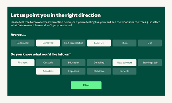
As well as restyling the existing WordPress site, we’ve added a few new lovely features, the first being the ability for single parents to add content to a bookmarked shortlist so they can save what’s relevant to them and come back later to read it. They can also filter the information section by topics that are relevant to them. There is so much information to digest at what can be a really difficult time if you’re a newly single parent, so we wanted it to be easy to find what you needed to know. Meanwhile the Gingerbread Comms team did the most amazing content overhaul ever seen in the history of website revamps, rewriting hundreds of old pages of content into new concise, organised easy to read pages, all tagged suitably to be easy to navigate.
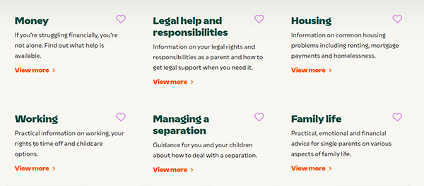
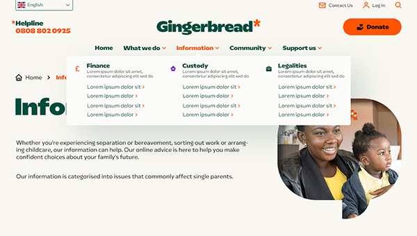
Of course, no website overhaul is complete without some serious attention given to the navigation. In this case, it meant reconsidering the structuring of all the content, along with building a swish new drop down menu. We also added a feedback block, which the Gingerbread team can turn on or off as they wish to on a page by page basis.

For us, our client’s UX is as important as their visitors’ UX, which is why we were keen to help change how they manage their mailing lists, if it would help them. This meant a quick SalesForce integration to help them work towards their CRM goals, and various other tweaks to help make their lives easier.
I was so happy when, after launch, Comms and Digital Manager Vaila McClure commented how, because we’re so responsive, helpful and technically capable, now they’re working with us “the world is their oyster” with regards to where this website can go over the next few months!
