We built Hotseat’s old website back in around 2010; a custom built CMS which had stood the test of time for over a decade. Shown below, it was a neat design – perhaps “of it’s time” with a web 2.0 look and feel, especially in the icons, but it was still smart and neat. It was designed by a design agency partner who then came to us to build it, back in the days before WordPress was as versatile as it is now, hence the custom CMS. It was just before we started using CodeIgniter as a framework (and have since moved to Laravel) so it was a completely bespoke CMS!
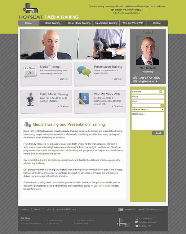
I think it originally had a flash hero, so that needed to be replaced with an image slideshow over the years (remember Flash?!). Plus we’d retrospectively made it responsive a while ago so that it worked on mobiles.
However, advances in server technology meant the site needed some upgrades, or it might fail to work smoothly. Neil at Hotseat meanwhile knew a new brand was on his horizon, so decided to go for a holding page for the time being, rather than invest in an old website, ready to start a fresh with a new website once he’s ready.
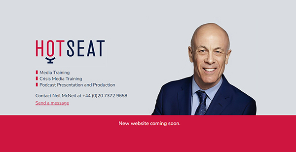
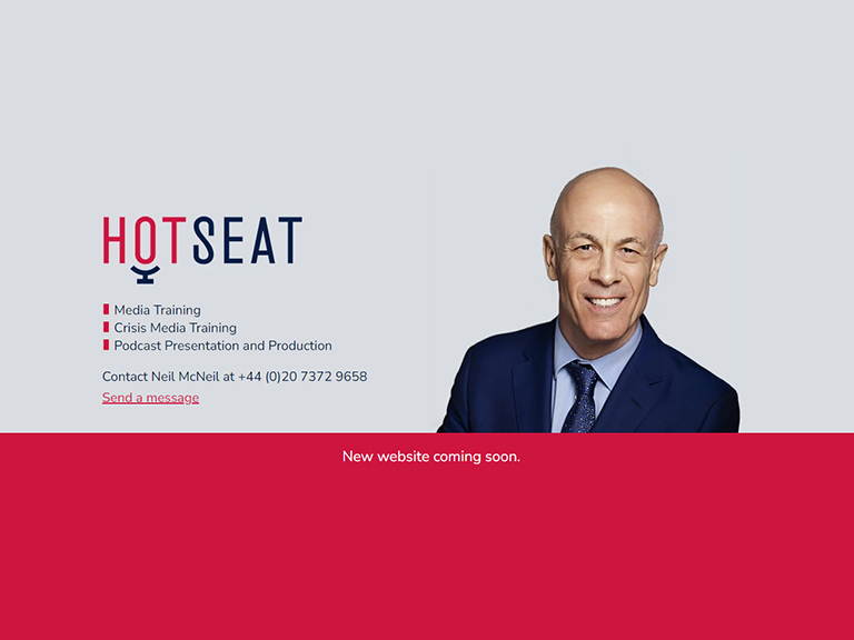
Therefore we designed his new holding page from his new brand assets and guidelines – and love his change in direction! Gone is the lime green and dated icons and in its place a gorgeous deep pink teamed with a sophisticated light grey. New professional headshots and completely fresh logo – perfectly conveying a modern “seat” – complete the look.
The holding page has a form rather than an email address to cut down on the risk of spam, and provides a professional message until Neil’s ready for a new site.
