I recently received a beautiful HTML email from the Affordable Art Fair, but I felt they could have made more of the video they included.
Underneath all the pretty pictures, there was a piece of text talking about a video – and then a still from said video. When I first opened the email I just scrolled quickly through to look at the prettiness – and in that frame of mind, the video still came as a bit of an abrupt end to an otherwise very visually appealing email design.

I recognised the image as a still from a video because of the black lines top and bottom and the fact that it looked a little fuzzy – but I’m not sure everyone on their mailing list would recognise it from these hints.
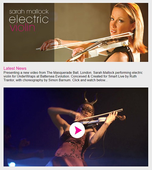
If you’re including email in a video, you’re going to have to make an image for it which will often be a still, as video isn’t reliably supported across all email clients. So then you might want to consider placing a play button over the still, to show that it represents it’s a video, as we did recently for Sarah Violin.

If you feel this is misleading – because clicking on the image won’t actually play the video, it’ll just take you to where you can watch it – then maybe add some text.
Let’s face it, video stills are often fuzzy or less than ideal as images, but adding some artwork over the top can explain their purpose more clearly and keep your marketing inline with your branding and the rest of your design.

