Working on the web means you come across a lot of websites and they don’t really stick in your mind unless they are super or super awful.
So when I came some across three super great looking websites recently I wanted to chat about them!
Clickbait 101 – do you want to go for a swing?
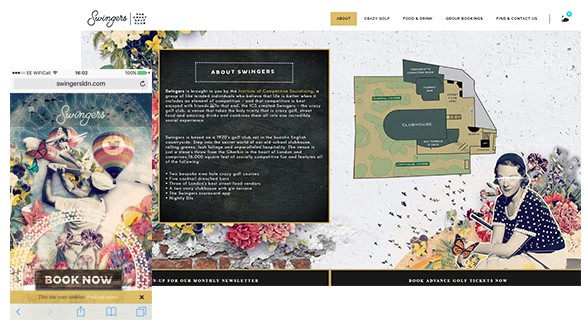
Swingers isn’t what you think it is, but we know what impression the name gave you! It’s a crazy golf club in London – but the name is intriguing right?! The design of the site is slick and very easy on the eye. Its really unique brand look mixes fine art with vintage elements.
The clear menu bar and clear call to action buttons at the bottom mean that as a user you aren’t going to get confused moving around this site. (Unless you were looking for a swinging party, then you are on the totally wrong website!)
The mobile version of the site (left) has a lovely eye catching landing page with a simple hamburger navigation to get you quickly to all the pages they have. Top points go to the Swingers.

Bold and beautiful – Four Seasons Resort Hualalai
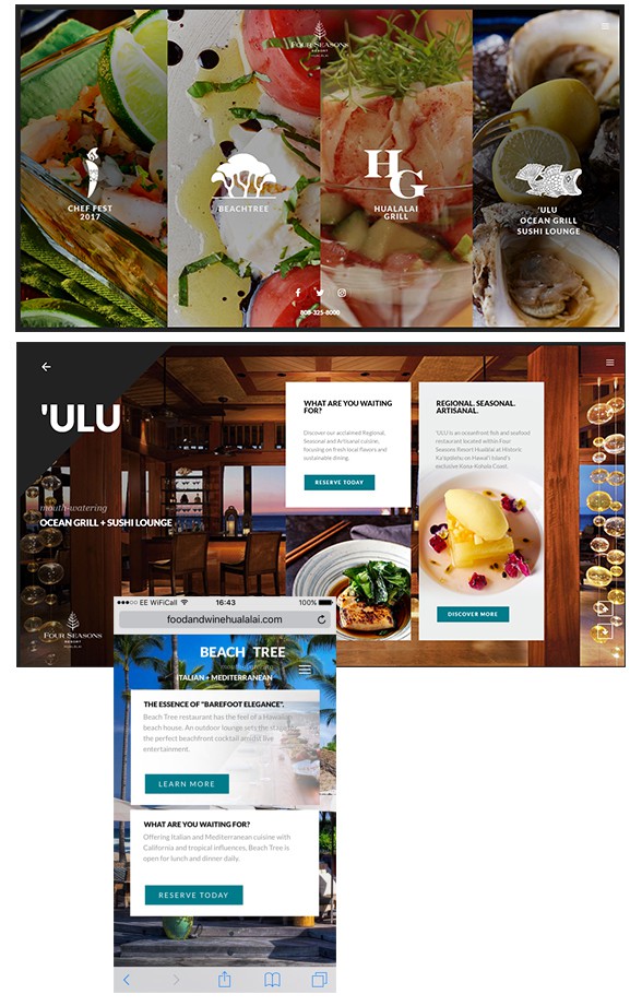
The Four Season Resort restaurants in Hualalai have a clean, sharp looking landing page that really caught my eye. The popular thing at the moment is having big horizontal hero images and sections stacked on top of each other but this design has flipped that on its side. The mouth-watering imagery is sure to make you want to click on one of the pictures which takes you to a page like below.
The mobile version keeps the elegant but modern format with the hamburger navigation button to make sure the user’s experience is simple. The call to action buttons are a striking turquoise colour which is strictly used only on these buttons, making them easier to spot and great to draw in users closer to the conversion goal!

A catchy design that would draw anyone in – The Better Fish
Now the layout of The Better Fish isn’t cutting edge but can I highlight how eye catching the first fold is! (the first block you see when viewing the website on a desktop). The heading is simple but punchy, the beautiful images have kept you looking and then you have the trust signals – the logos which we all know and (maybe) trust.
If you just keeping swimming (scrolling) down the page, you will see the perfect selection of complementary but not overwhelming colours. They definitely got my attention, I stayed a little longer looking delicious looking recipes – great engagement bait on the homepage!
Better Fish use engaging phrases that left a positive impression of the brand in my mind. Phases like ‘Move over kale, Australis Barramundi is the new superfood’ and ‘We work on the cutting edge of sustainable food production’ made me think this is a company that knows how to present itself right to today’s more eco-conscious and clean eating audiences.

In conclusion…
Our favourite site of these has got to be the Swingers website – the main reason, the positive surprise we got when we came across it!! (Someone sent us the link, we weren’t searching for swingers promise!).
