;transform: ;msFilter:;'%3E%3Cpath d='m20.487 17.14-4.065-3.696a1.001 1.001 0 0 0-1.391.043l-2.393 2.461c-.576-.11-1.734-.471-2.926-1.66-1.192-1.193-1.553-2.354-1.66-2.926l2.459-2.394a1 1 0 0 0 .043-1.391L6.859 3.513a1 1 0 0 0-1.391-.087l-2.17 1.861a1 1 0 0 0-.29.649c-.015.25-.301 6.172 4.291 10.766C11.305 20.707 16.323 21 17.705 21c.202 0 .326-.006.359-.008a.992.992 0 0 0 .648-.291l1.86-2.171a.997.997 0 0 0-.085-1.39z'%3E%3C/path%3E%3C/svg%3E)
The website 99designs.com can be a bit of a dirty word amongst designers but I did notice what I thought was a nice design feature on their website earlier.
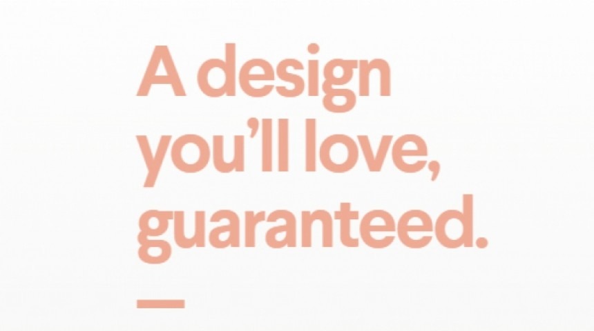
With their grey logo and navigation they bring colour to the hero area of their home page by changing their text and CTA button colour depending on the logo they’re showcasing.
There are more colours lower down the page, but when you first get to the site you’re greeted with a neutral colour palette from the brand itself, and an injection of colour that can change as often as their showcased work.

I really like this approach as it means you’re not restricted to a limited colour palette – too often basic logos can mean you end up with a website in 1 or 2 colours. I’m not 100% convinved the lower part of their home page gels completely perfectly, but I felt the top part of the home page made a good first impression.