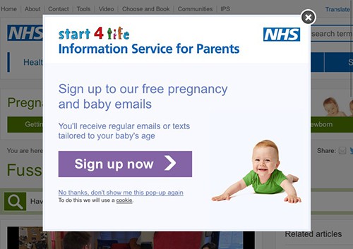
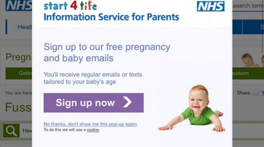
All through my first pregnancy and for months afterwards I found the emails I received from the NHS informative and reassuring. They would always stay unread in my inbox until I had time to read them properly – I actually felt I was doing my bump / baby a disservice if I didn’t read them throughly.
But one thing has always stood out to me about them, and that’s the user journey once I click on a link from the email.
Every time I visit the NHS website from a link in one of those pregnancy/early years emails I see a prompt to sign up for the same newsletter.

And everytime I think “I’m already on that newsletter – they should know I am – they don’t need to show me that pop up”.
(In putting this blog post together I’ve just noticed the link to stop seeing the pop up, along with an explanation about cookies – which is great. But as a user I’ve always just quickly clicked the [x] to close it each time.)
Pop ups are annoying. They get in the way of what you’re trying to do and Google recommends against them for SEO.
My NHS experience could be greatly improved if the links in the email just carried a little referrer tag so that the website knew not to show me the pop up because I’d come from the mailing list they were trying to sell me.
I’ve got a reasonable amount of patience, and these emails are important to me. But there will be plenty of situations online where this exact same thing is happening for people who hate pop ups and who aren’t that invested in what they’re reading. If that could be your audience, make sure you improve your user journey and don’t annoy them with unnecessary ads for things they already have.

