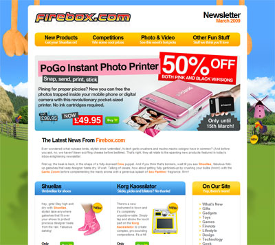
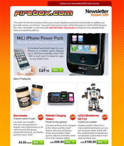
For a while now I’ve thought Firebox newsletters have been good, with eye catching designs that perform well, such as the one below. Even if you’re using an email client that can’t display the background image, the centre area is still very smart.

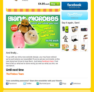
But I was particularly impressed by their most recent offering – as they’re really introducing a level of interactivity with their emails, and turning their shopping site into a community.

Don’t worry – if you’re getting bored of “online communities” they’re not trying to be the next Facebook (they just link you to their Facebook page), they’re just interacting with their visitors enough to engage their attention.
In particular, the poll down the right hand side, along with results from last time, mean you don’t have to get involved with the site – they bring the community to you and ask very little from you in order for you to be involved.

I’m not quite so convinced by the “Say it again, Sam” section, as at first the icons are almost too small to see that they’re just providing quick links to everything else in the email. (They look clearer when I display the email on line as opposed to in my gmail – they’ll be exactly the same, but I guess the page is less busy so they’re easier on the eye.)

But I can see why they did it – by making their email so detailed they run the risk of you forgetting the products at the top – this is quite long as email newsletters go. So it’s just as well to have them there. However I think it’s snappy enough that you can skim browse it and in a quick scroll get back up there again. Good work Firebox!


